the+shitter+in+winter%28crappy%29.jpg)
+back+of+painting+%28deserves+better+on+the+front%29.jpg)

step two: crop marks help me to situate the subsequent image on the crappy image. get the brush loaded and find the new composition.
crop+marks.jpg)
new+composition.jpg)
step three: mix the basic colours and block in the main negative shapes. this one started with the sea and sky, where there is less visual content, therefore less fussing. obliterate the crappy painting without mercy. it's your labour so it's not easy. in this case "the shitter in winter" had already been painted at least three times, so repainted at least twice. you won't get those hours back so the new effort better be worth it. if not, you can always repaint it all over again, again. but the freakish notion of infinite return should scare out something less than worse.
skyseablockin.jpg)
step four: the landmass is next up for the treatment. since there is much more visual content here, the area is not uniformly blocked in. colour drawing the various shapes inside this section with a loaded brush is the bulk of the work here.
paintedland.jpg)
step five: the shapes and colours that make up the landmass need development so best to keep hacking away at them. put more wine in the glass and smoke in the pipe and get cracking. a robert henri quote comes to mind: "light is colour". land of talk is on the stereo.
morepaintedland.jpg)
step 6: you can always go back and reassert your labour. often for me that means emphasizing a shape with a line around all or part of it. as far as representational work goes, it seems to me that if you get the shape right, the colour doesn't really matter. still, if the point is fidelity to a certain scene you can't cut yourself too much slack. and if you successfully get the shapes, then you've got a much better chance at getting the scene you wanted -- which is largely why i painted the picture to begin with. now what i've done on land i need to do in sea and sky. paint, that is.
funwithocean.jpg)
funwithsky.jpg)
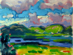
step 7: things are nearly good enough to quit. there are edits around edges mainly, especially between the big negative shapes. i want the shoreline to look like it meets the water and gets wet. there are a few places that can use more paint, more colour, areas that are too slow -- where the light is sinking and not coming back with the same confidence as from adjacent areas. but mainly and mostly, i want the painting to look unified. i want it to look like "it's all made of the same material" which is a line that stuck in my head about fifteen years ago while reading a text on cezanne's "card players". it should look at least as good as the mailbag that it's painted on, or the blank wall around it. glorified interior decorating. "view of meat cove from black point". long live cape breton. long live meat cove!
view+of+meat+cove+%28less+crappy%29.jpg)
No comments:
Post a Comment